📊
2D Projection
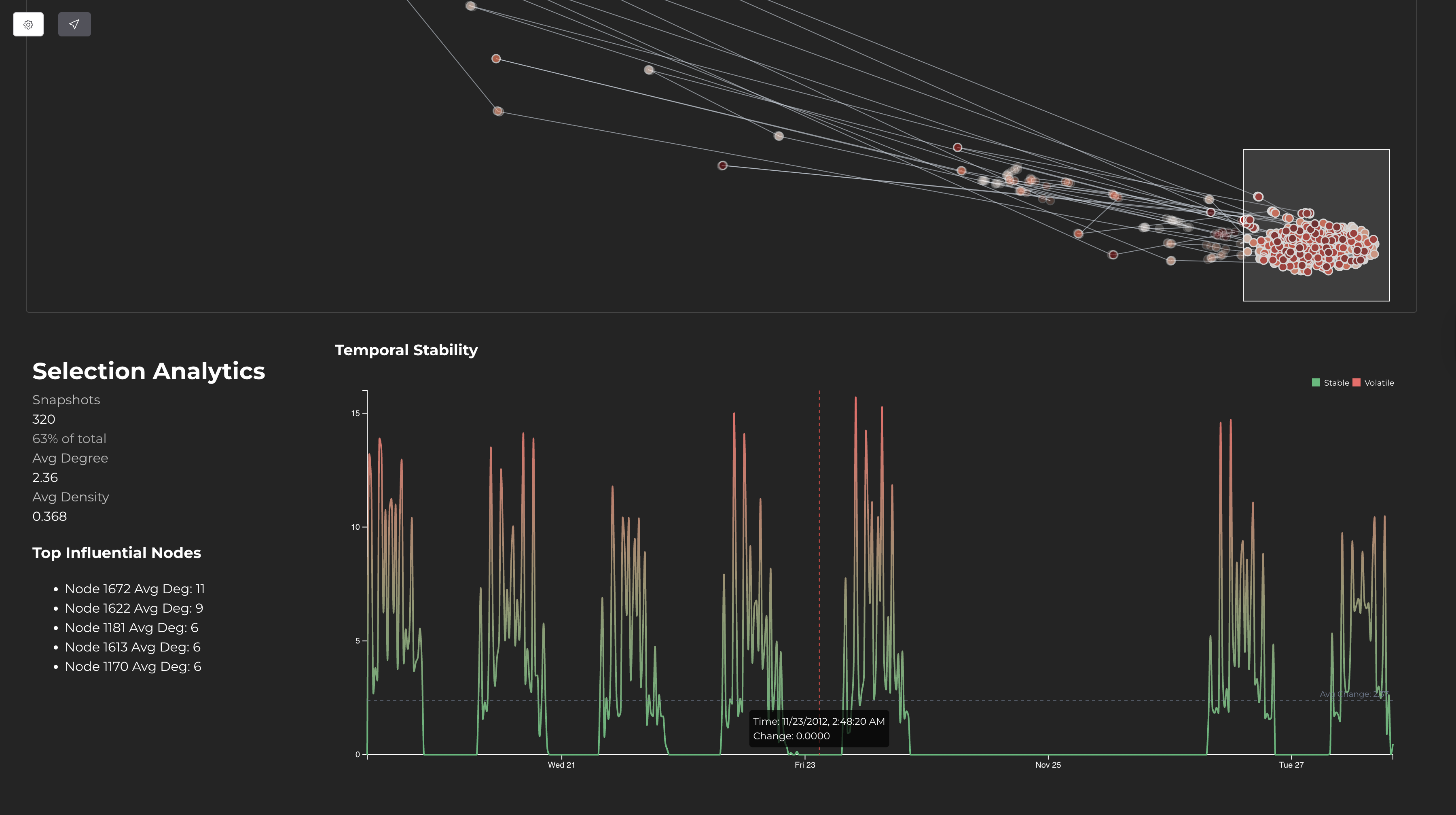
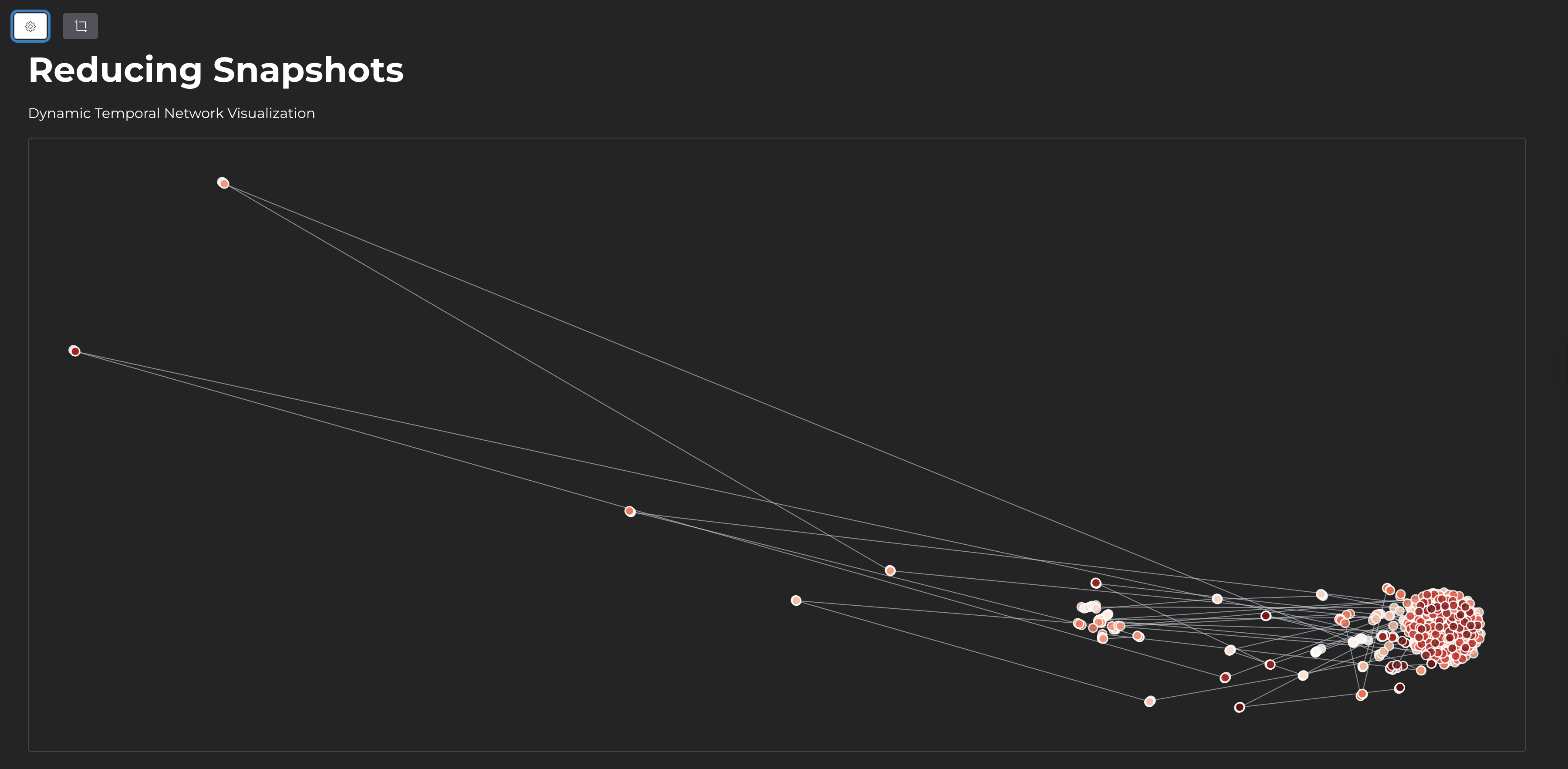
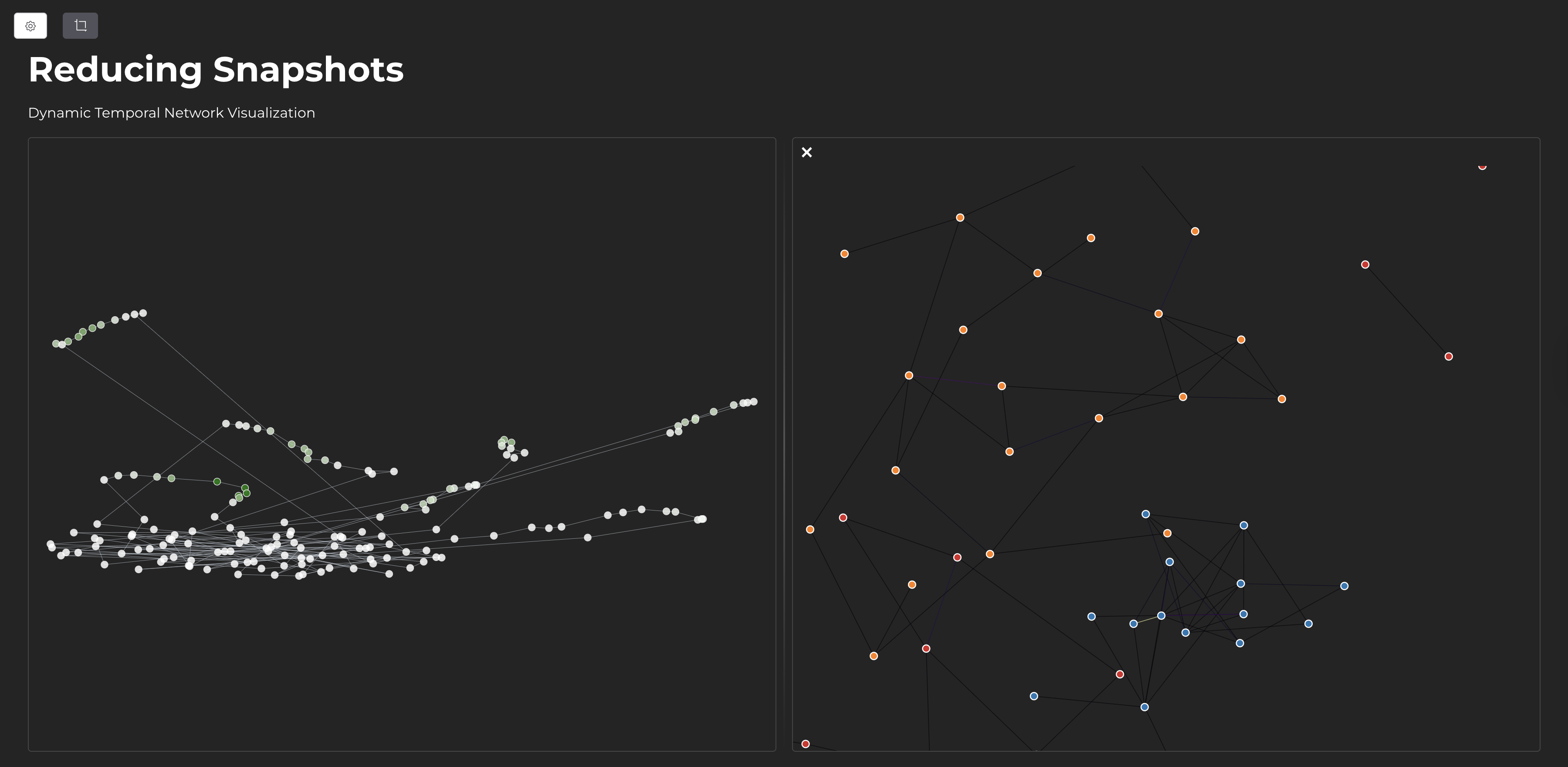
Network snapshots are projected into 2D space using UMAP. Similar network structures appear close together.
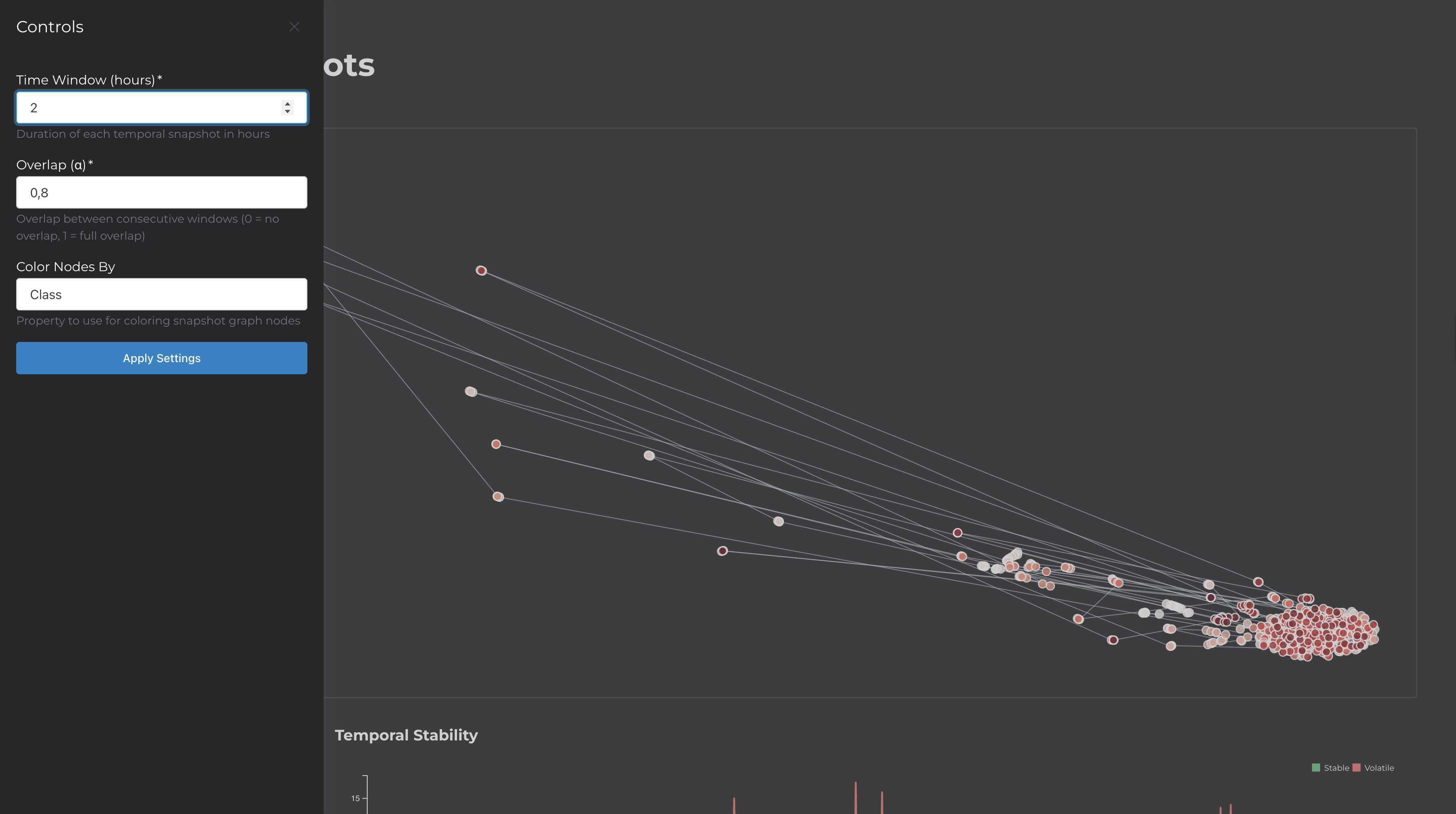
This application visualizes temporal network data—datasets where entities interact over time (e.g., contact networks, communication logs, transaction records).
The tool divides the data into time windows, creates a network snapshot for each window, and uses UMAP to project these snapshots into 2D. The result is a scatter plot where each point represents a network state at a specific time. Points that are close together have similar network structures.
| Component | Technology | Purpose |
|---|---|---|
| Build Tool | Vite + TypeScript | Development server and bundling |
| Visualization | D3.js | Scatter plots, force-directed graphs, line charts |
| Dimensionality Reduction | umap-js | Projects adjacency vectors to 2D |
| State Management | alien-signals | Reactive updates between views |
| UI Components | Shoelace | Drawer, buttons, form elements |
| Processing | Web Workers | Runs pipeline off main thread |
The main thread handles rendering. A Web Worker performs the CPU-intensive pipeline (discretization, vectorization, UMAP). State signals synchronize the projection view, snapshot graph, stability chart, and analytics panel.
To use a custom dataset, create a public/config.js file:
export default {
  url: "/your-data.csv",
  fields: {
    timestamp: "time",
    source: "from",
    target: "to",
  },
  visuals: {
    colorBy: [
      { label: "Type", value: "type", type: "categorical" }
    ],
    tooltipFields: ["type"],
  },
  timeFormat: "JS",
  initialConfig: {
    timeWindow: 3600000,
    alpha: 0.8,
    colorProperty: "type",
  },
};
The CSV must have columns for timestamp, source node, and target node. Additional columns can be used for coloring and tooltips.
Reducing Snapshots for Temporal Network Visualization
This tool implements techniques based on the research paper:van den Elzen, S., & van Wijk, J. J. (2016). Reducing Snapshots to Points: A Visual Analytics Approach to Dynamic Network Exploration. IEEE Transactions on Visualization and Computer Graphics.
DOI: 10.1109/TVCG.2015.2468078